Sunday 12 December 2010

Editing our Print Advert

In order to create our print advert we used
http://www.channel4.com/about_c4/styleguide
http://www.4creative.co.uk/flash/#/print/press_and_poster/


Using the style guide I was able to get the Channel 4 logo.  
ave images of peoples obessions including within the documentary in


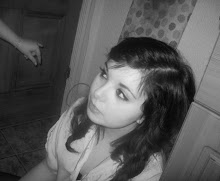
The first idea we had was having a box filled with merchandise, of peoples obsessions, however our other idea was to have a closeup of an eye, and have images of people's obsessions within the eye.
In the end we decided on the latter.


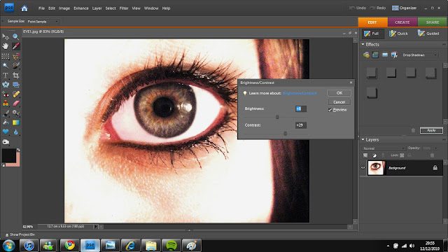
The main image used was a close-up of an eye that I took. Using Adobe Photoshop I changed the contrast and brightness of the image to give a sharper focus.


After that I added another tool and using the selection tool and pain buckets tool, i made the required boxes for the text to be place in.


After the font, and Channel 4 logo were added, I lowered the saturation of the main image, and added on the slogan 'What's your's?'


The next thing to add in we're the images in the eye. 


Twilight Tshirt taken on an Iphone.


I changed the opacity to around 50% and used the Rubber tool to erase the edges of the images, and lowered the opacity so that the harshness on the brush wasn't sharp.


After this, I realised that the text boxes should go the opposite side, so after doing that, I changed the colour of the Channel 4 logo to a white shade, using the paint bucket tool.


After that I played around with the contrast and saturation until the image was sharp and striking.

The final product.


Editing our Documentary


We used video effects from the box to the left so create a lens flare on the selected clip, We used the razor tool to cut between the clip so that the brightness could increase and therefore look much better. It also adds to the relevance of the Harry Potter 'magic' theme.


When creating the opening titles it took a while to decide on how to end the Title at the end, as we did not want an image to go behind the graphics as we felt it would distract form the Title. We added a video transition from the 3D effects list and chose this. It fits really well, as the curtain like transition gives a feel as if it is 'opening the show'


After editing for quite some time, we noticed that there was a red line at the top. This means the video clips below needs rendering therefore the video quality is not perfect at the moment, hitting the 'enter' key then renders the video and produces a higher quality video.


We used the razor tool again to create a several cuts between the pan of the bedroom covered in posters, as it seemed to be creative. It took some time because you have to cut the music in time with the visual as they were not linked at the time.


When editing the chromakey, they only thing that takes a while is getting the similarity and threshold correct. After some fiddling around we got the best we could get result. However you could still see some of the curtains in the background due to the clip being quite a dark saturation, and has a blue hue to it.
We tried putting the 'Blue-screen' effect onto it, and we found that it worked much better and the edging was smooth.


Adding the graphics was one of the last things we did. pressing F9 gets the Text box up where we then added our font. We decided to lower the opacity so it wasn't a very bold font. 

For the graphics on the interview however, we gave text a drop shadow and an outer glow so that it would stand out much more, because our mise-en-scenes are quite colourful and bright.