Wednesday 5 January 2011

Final Products.

Documentary


Radio Trailer


Print Advert


1. In what ways does your media product use, develop or challenge forms and conventions of real media products?

My media product follows the forms and conventions of real media products  rather than challenging or developing them.

TITLE SEQUENCE.


For our opening titles, I researched different documentaries and found that they sometimes used a montage of clips, so I decided that would be a good idea for our. We filmed a montage of clips, relevant to our documentary. We used a varied amount of different peoples obsessions, such as ironing, and 'Pokemon' within the titles so that the audience would get an idea of what the programme will include. We used the Pokemon cards both at the start and end of our documentary but we reversed one of them so it completed the opening titles.

We used simple graphics for the Title, and extended the timing so that it was obvious to the audience that it was the title.


INTERVIEWS

I followed all of the forms and conventions of an interview.
The eye line of the interviewee is always one third of the way down the screen and is filmed in medium shot, medium close up and close up .
In this case the interviewee was filmed in medium closeup, as is positioned right of the screen.


Interviews are never filmed with a light source behind the interviewee.For the mice-en-scene we created a collage of Harry Potter related images, as it was relevant to the content of the interview. Just like the professional to the right,  He is evidently in an office, as he looks professional.
We also made sure the interviewee never looked at the camera, so in doing so we positioned the interviewer to the left of the camera.

CUTAWAYS

The cutaway, are one of the main details in interviews. They break them up and illustrate what they're talking about and to avoid jump cuts when the questions are edited out, thus we asked them to repeat the question back when answering the question, so it made sense. I used cutaways from a Harry Potter merchandise booklet as she was talking about how her mum dislikes buying her the items.


VOICEOVER

The Voice over holds the narrative together. We chose to have a man who is quite cheerful, and up-beat to match the tone of our Documentary. He speaks in Standard English, and in a calm and clear delivery


GRAPHICS


The graphics always Anchor the person 
The second line usually states their relevance to programme 
I have followed both of these and have used a bold clear font that does not distract.
The transition of it coming onto the screen is a very quick fade

ARCHIVE FOOTAGE

We used quite a lot of archive footage in our documentary, however we tried to make it more creative by filming them on angles or panning around or up and down printed out images. 
In one of our interviews we used chroma key, thus we used archive footage as our mise-en-scene. Twilight clips, from each movie where cut into the background. Also, in our Justin Bieber interview we inter cut part of his music video with footage that we filmed, with a music bed of his song. It proved to be effective.


VOX POPS


There arne't really any Vox pop conventions, however they are usually placed at the center on the screen and looking at the interviewer and not the camera.


MUSIC

We included quite a lot of music in our documentary such as 'Just Can't Get Enough' by Depeche Mode. We used this as it works extremely well for the opening titles, and the up-beat music goes well with the tone and as it is quite a well known song, the audience are likely to remember it and it will attract them
We also used Justin Bieber music within the Justin Bieber interview as it is relevant and makes it sound like the music may be playing in her bedroom in the background.
During the Harry Potter interview we used the well-known theme tune of Harry Potter as it gives the audience recognition of what the interview is about before the interview.
We had to email the Record Company's of the artists music we had included, however we did not get any response.

CAMERAWORK

For our Documentary we tried to use creative camerawork where possible. Mostly in the opening titles, where we used Panning to left and right, Close up's, extreme close-up's, long shots creative angles, and a Zoom.


PRINT ADVERT


Advert


RADIO TRAILER


2. How effective is the combination of your main product and ancillary texts?

3. What have you learned from your audience feedback?

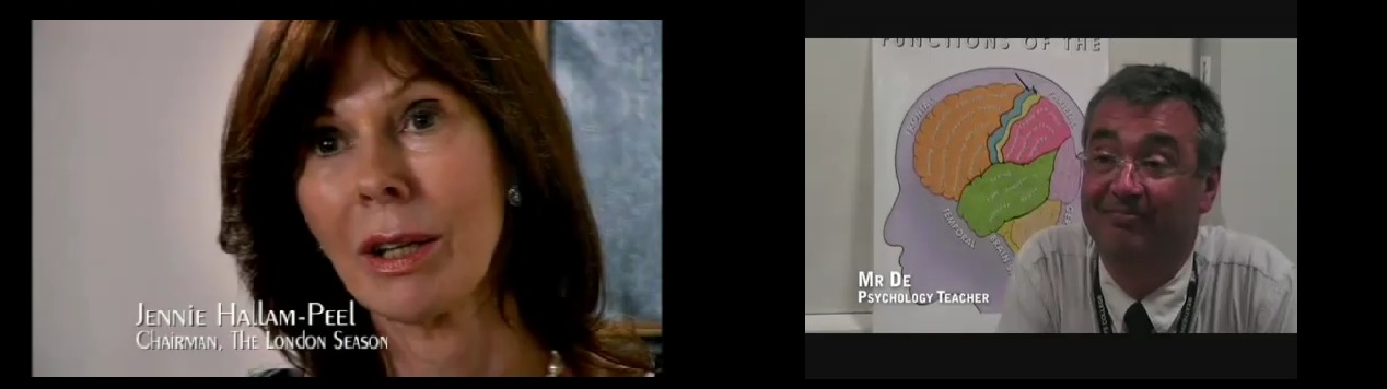
In order to get audience feedback, our group asked a focus group of 21 people to watch our documentary, look at our print advert and listen to our Radio Trailer and then give us feedback at the end. We produced a questionnaire which they then filled out.


Question 1

How entertaining did you find the Documentary?


This question gave us an overview of how people found the documentary. The results told us that 40% thought that the documentary was extremely entertaining, whilst nobody didn't enjoy it at all.


Ellie Jones, aged 18 said,

"I thought it was really entertaining because the music is really quirky, and the fact it was about up to date celebrities was more interesting and I think that the target audience would find it intriguing. I really enjoyed it"

Question 2

How informative did you find it?


Although 48% said the documentary was quite informative, 33% of the people didn't think it was hugely informative. I think this is because the interviews lacked personality, although the documentary itself is just to inform the audience of people's different obsessions and how far they will take them, it didn't really come across within the 5 minute extract.

Darren May, aged 25 said,
"I didn't really think that the programme informed me of anything, but is it supposed to? I was informed of the different fan's obsessions but I didn't really learn much from it."


Sian Leask, aged 17 said,

"I really like the Justin Bieber interview because I found it really funny how she went really over the top about his birthday in the book, and her room was crazy!"

Question 3

What did you think about?


The graph results show that the audience found the editing particularly good, however 1 person was not impressed.


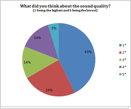
According to the results it shows that the sound quality has the best feedback from the documentary having 43% of people voted for the highest possible option. Again, though, one person found the sound quality not to their standards.


The camera word results showed varied opinions. However 29% said it was very good, and 10% saying it was not.

"In some places, in some of the cutaways, the camerawork looks a little bit shaky, but i think that the great editing kind of cancels it out, especially the lens flare on the wand! I thought that was great"

Overall the majority of people said that they liked the editing most, whereas the camera work may need a little bit of work and there is room for improvement on the sound quality.

Question 4

Do you think this five minute extract encourages you to watch the full programme and why?

100% of the people said that it did.


Question 5


How do you think the documentary compares to other professional documentaries?

67% of the focus group said that we followed the codes and conventions very well, whilst 11% of them said that we used a good framing and a the Chromakey worked really well.


Question 6


What are the strengths and weaknesses of the Documentary?

Katie Webb, age 17 said,

"Definitely the creative editing. I thought that the wand lighting up was really effective. And when the Justin Bieber video was faded into the cutaway of the bedroom with all the posters, I thought it worked really well"

"I thought the music in the opening titles was picked really well to the relevance of the documentary"


38% of the focus group said that the voice over was the main weakness. We tried to go for quite an upbeat, and cheerful voice, however, in the end, it just did not go well.

30% of the group said that the cutaways was one of the main strengths, and 23% said that the editing was also one of them.


Question 7 


What are the strengths and weaknesses of the radio trailer?

50% of the people said that The sound quality was the main strength of the radio trailer, whilst 6 people said that they didn't like the voice over chosen and 4 people said that there was a lack of information.

Question 8

What are the strengths and weaknesses of the print advert?


" I love the advert! I really like how there is pictures in the eye. I think the actual photograph looks really creative, it looks professional!"

"It shows a really creative idea, and its produced perfectly, I like how the images in the eye reflect what 'obsessions' are on peoples minds, I think it would grab anybodies attention, I grabbed mine anyway"


The main strength was the creativity of the advert giving 48%

More than half didn't find any weaknesses within the advert, however 29% said that they thought the amount of content was too much (the content in the eye).


Question 9

Do you think the print advert is effective and makes you want to watch the documentary? 

100% said yes

Overall, the print advert seemed to receive the most positive feedback, whilst the radio trailer received the most negative. 

The voice over chosen throughout the documentary and the radio trailer seemed to be an issue as that was the most negative feedback we got form anything. It may be due to peoples taste, however I feel that the voice didn't fit the tone of the documentary, and its target audience did not think so either.


Facebook comments

Documentary


Print Advert


Radio Trailer


4. How did you use media technologies in the construction and research, planning and evaluation stages?


Sunday 12 December 2010

Editing our Print Advert

In order to create our print advert we used
http://www.channel4.com/about_c4/styleguide
http://www.4creative.co.uk/flash/#/print/press_and_poster/


Using the style guide I was able to get the Channel 4 logo.  
ave images of peoples obessions including within the documentary in


The first idea we had was having a box filled with merchandise, of peoples obsessions, however our other idea was to have a closeup of an eye, and have images of people's obsessions within the eye.
In the end we decided on the latter.


The main image used was a close-up of an eye that I took. Using Adobe Photoshop I changed the contrast and brightness of the image to give a sharper focus.


After that I added another tool and using the selection tool and pain buckets tool, i made the required boxes for the text to be place in.


After the font, and Channel 4 logo were added, I lowered the saturation of the main image, and added on the slogan 'What's your's?'


The next thing to add in we're the images in the eye. 


Twilight Tshirt taken on an Iphone.


I changed the opacity to around 50% and used the Rubber tool to erase the edges of the images, and lowered the opacity so that the harshness on the brush wasn't sharp.


After this, I realised that the text boxes should go the opposite side, so after doing that, I changed the colour of the Channel 4 logo to a white shade, using the paint bucket tool.


After that I played around with the contrast and saturation until the image was sharp and striking.

The final product.


Editing our Documentary


We used video effects from the box to the left so create a lens flare on the selected clip, We used the razor tool to cut between the clip so that the brightness could increase and therefore look much better. It also adds to the relevance of the Harry Potter 'magic' theme.


When creating the opening titles it took a while to decide on how to end the Title at the end, as we did not want an image to go behind the graphics as we felt it would distract form the Title. We added a video transition from the 3D effects list and chose this. It fits really well, as the curtain like transition gives a feel as if it is 'opening the show'


After editing for quite some time, we noticed that there was a red line at the top. This means the video clips below needs rendering therefore the video quality is not perfect at the moment, hitting the 'enter' key then renders the video and produces a higher quality video.


We used the razor tool again to create a several cuts between the pan of the bedroom covered in posters, as it seemed to be creative. It took some time because you have to cut the music in time with the visual as they were not linked at the time.


When editing the chromakey, they only thing that takes a while is getting the similarity and threshold correct. After some fiddling around we got the best we could get result. However you could still see some of the curtains in the background due to the clip being quite a dark saturation, and has a blue hue to it.
We tried putting the 'Blue-screen' effect onto it, and we found that it worked much better and the edging was smooth.


Adding the graphics was one of the last things we did. pressing F9 gets the Text box up where we then added our font. We decided to lower the opacity so it wasn't a very bold font. 

For the graphics on the interview however, we gave text a drop shadow and an outer glow so that it would stand out much more, because our mise-en-scenes are quite colourful and bright.